ASOS · 2025 — Present · Product Designer
Onboarding
As first-time downloads grew, onboarding became the activation bottleneck. We redesigned the end-to-end flow to get users in faster, improve notification opt-in, and surface ASOS's breadth of brands earlier.
40% → 90%+ notification opt-inThe Opportunity
Alongside this project, I was working on a separate growth initiative that increased first-time app downloads by 35% YoY. As more users entered the funnel, onboarding became a critical activation point. We had an opportunity to get users into the app faster, improve notification opt-in, and better showcase ASOS's breadth of brands.
Goals
We aligned on three goals. First, increase notification opt-in, as notifications are one of the strongest levers for bringing customers back into the app. Second, reduce onboarding time and get users to value faster. Finally, support the broader business objective of converting more first-time downloads into engaged customers while helping them discover the breadth of brands available on ASOS.
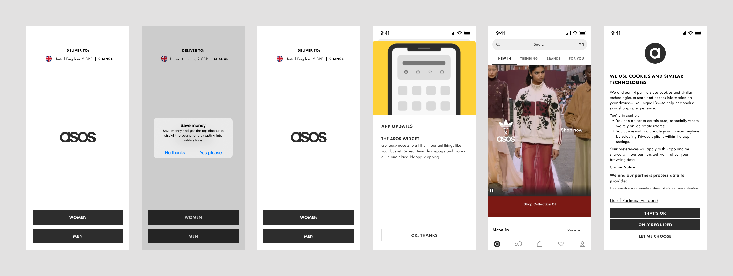
Current Experience
Looking at the existing experience, four themes emerged. First, users had to move through multiple screens before reaching the app. Second, the notification prompt appeared without a strong value proposition. Third, the breadth of brands available on ASOS wasn't being surfaced early enough. Finally, parts of the onboarding experience contained legacy content that no longer aligned with our objectives and was adding friction to the journey.
Explorations
One of the first directions we explored was a feature-led onboarding. Rather than getting users into the app as quickly as possible, this concept focused on introducing some of the new experiences available within ASOS. The thinking was that if users understood more of the value upfront, they'd be more likely to engage later.
After exploring a feature-led approach, we moved towards personalisation. The idea was simple: if we could understand a customer's style preferences early, we could create a more relevant first experience. We explored outfit-based style selection, connecting preferences to future recommendations and notification content. While users responded positively to the concept, we found ourselves introducing more questions and additional onboarding steps at a time when one of our primary goals was reducing friction.
Building in Swift allowed us to test ideas much more aggressively than we could in Figma. Across the project we explored around 16 variations, experimenting with different levels of personalisation, brand selection and onboarding depth. The key learning was that the more we asked users upfront, the longer onboarding became. We ultimately prioritised activation and moved deeper personalisation into the in-app experience.
Before
After
Delivery
Because the concepts had already been built and tested in Swift, engineering could reuse much of that thinking during implementation. The final experience removed redundant screens and reduced onboarding time by over 50%. We then launched the redesign as an A/B test against the existing onboarding flow to measure impact before rolling out more broadly.
The final solution removed redundant screens, surfaced key information earlier and reduced onboarding time by over 50%. Rather than adding more personalisation upfront, we focused on getting users into the app faster and moved deeper personalisation into the in-app experience.
Personalisation in Motion
Alongside the delivery work, I continued exploring how personalisation could come to life as part of the onboarding flow. These interactions around brand selection, style discovery, and some more playful animation directions are still being explored as the team defines the next phase of the experience.
Results
Two weeks after launch, notification opt-in increased from around 40% to over 90%. Importantly, we achieved this while keeping onboarding completion broadly stable at only minus one percent. Cookie banner acceptance was also largely unaffected. We believe the uplift came from improving the timing of the permission request, reducing onboarding fatigue and providing clearer context around the value of notifications. The next phase focuses on increasing login rates through personalisation and brand awareness.
There were some trade-offs. Completion rate decreased by 1% and cookie banner opt-in by 0.5%, however these changes were significantly smaller than the gains we saw elsewhere in the funnel.