Homeppl · 2021 · Principal Designer
Rental Risk
Redesigning the tenant verification experience to reduce churn, cut application time, and help landlords assess risk with confidence.
−35% churn · −50% application timeA Broken Experience
An estate agent would create a request in Homeppl's CRM for a credit check on a potential tenant. The tenant would receive an email with a link to a wizard, fill out personal information, and upload documents: passport, bank statements, and more. That information was then validated by the ops team before going back to the agent.
In practice, the wizard was a mess. A protracted process led to user attrition and increased workload for Ops and CS teams. Users didn't know how long the form would take, there were no progress indicators, and people got stuck without clear next steps.
Flow Overhaul
I conducted an end-to-end audit using Hotjar and heatmaps to pinpoint drop-offs. I shadowed the Ops and CS teams to understand the full picture: not just the user side, but the internal pain too.
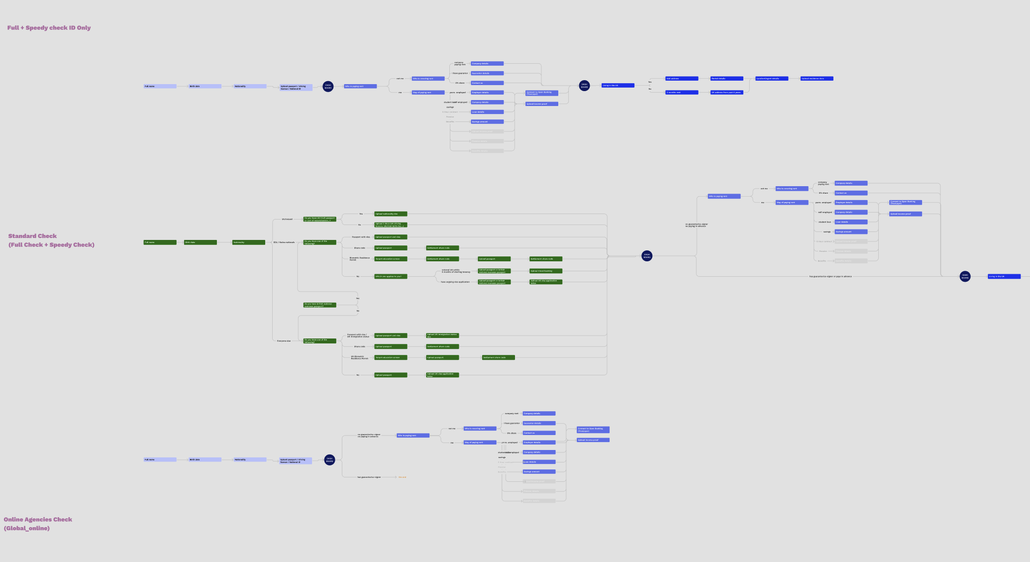
Held weekly meetings with Ops and Product, then restructured the flows into three distinct tracks: Income, Identity, and Residence. We tackled the simpler ID and Income flows first to build momentum before scaling up to the more complex Residence flow. The final design used progressive disclosure to reduce cognitive load at each step.
New Dashboard
I designed a new dashboard that gave users a snapshot of their next steps and overall progress. Cards allowed easy navigation back to any section for edits and provided a clear option to submit once completed.
On the document upload side, discussions with users and the Ops team revealed clear pain points: people didn't know what made a valid document, and feedback on failed uploads was too vague. We addressed this with explicit do's and don'ts on each upload screen and a more robust post-upload feedback loop.
One unresolved tension: drag-and-drop worked well on desktop but the stacked mobile solution wasn't ideal. Data showed the majority of traffic was desktop, so we shipped the interim solution and flagged mobile as a future iteration.
For Open Banking, I redesigned the bank connection page to emphasise trust: a secure icon on the CTA, TrueLayer branding, and FCA references. A/B testing confirmed that embedding the CTA into the page body rather than anchoring it to the bottom disrupted scroll inertia and led to significantly better conversion.
Interactive prototype — click to explore
Internal Tooling
Alongside the tenant-facing redesign I took on a second stream: the internal OPS system the team used to verify applications. Dense data tables made it hard to surface critical information quickly. Inconsistent visual hierarchy, no clear next steps, and actionable items buried in noise.
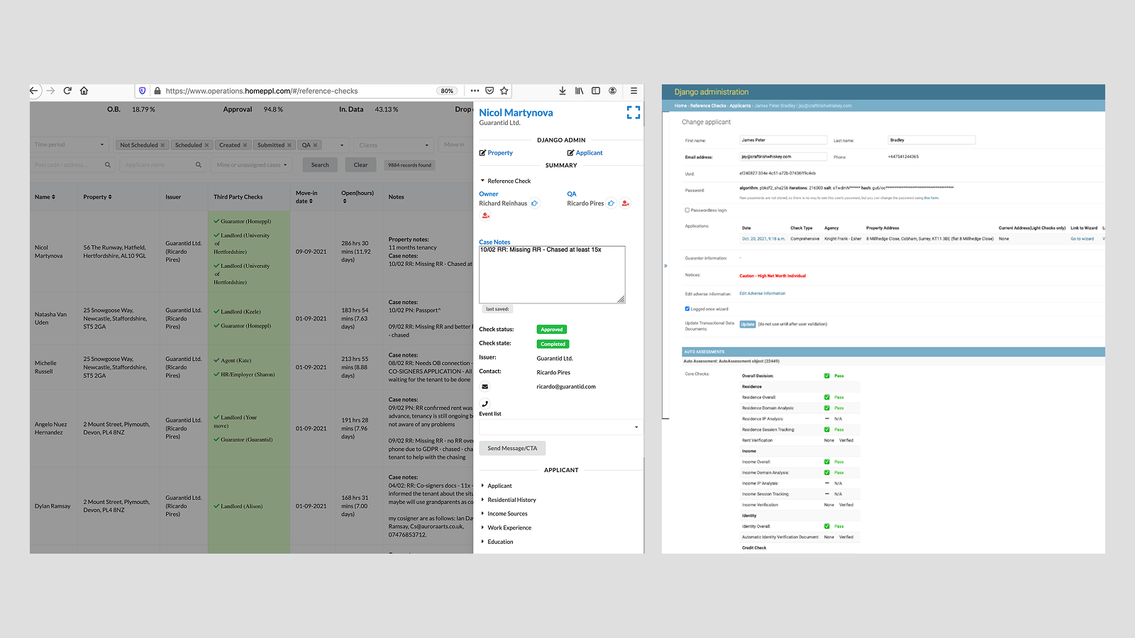
OPS system — before
Working with the Product Manager, the Ops team, and our Engineering Lead, I redesigned the applicant list and detail views. The MVP prioritised ID and Income checks, the majority of the team's daily workload, using colour-coded status, icons for scannability, and better filtering. We presented to senior stakeholders and the CEO, secured budget, and shipped the first version.
OPS MVP — after
Results
The redesign shipped and delivered measurable impact across the tenant funnel: churn fell by 35% against a target of 30%, average application time dropped by 50%, and document upload errors reduced by 40%. Alongside the tenant experience, the OPS MVP went live, giving the team faster, clearer visibility into each application.
Learnings
Halfway through the project we realised handling all three flows within the timeframe wasn't feasible, so we focused on Identity first. It was a tough call but the right one: the modular design system meant engineers could work independently and new designers could pick up features without starting from scratch. Better upfront scoping would have surfaced this constraint earlier.
The CEO hadn't worked with a designer before, so I made a point of sharing work regularly at the weekly all-hands. It was a practical way to manage expectations but also raised the profile of the design team with people outside the tech org.
Building trust for Open Banking turned out to be as much a marketing problem as a UX one. I worked closely with the marketing team on messaging, Trustpilot social proof, and A/B testing copy. Clean UI alone wasn't enough to get users to connect their bank accounts.
Shadowing the Ops team, attending estate agent calls, and sitting in on support gave me a much richer picture than the product brief alone. That context fed directly into design decisions and made cross-functional conversations considerably easier.